Reference Box
Field List
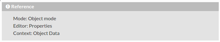
The following code is currently used to add a reference box:
.. admonition:: Reference
   :class: refbox

   | Mode:     Object mode
   | Editor:   Properties
   | Context:  Object Data
Which will render as:
It would be nice to have some better formatting, such as distinguishing the left column and indenting the right.
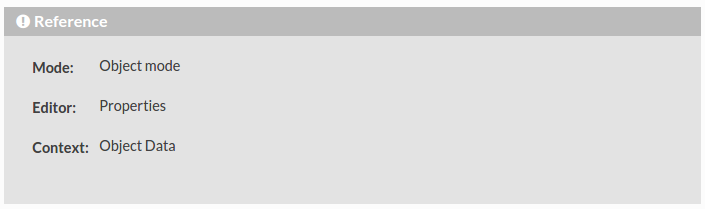
This can easily be done by using this code instead:
.. admonition:: Reference
   :class: refbox

   :Mode:     Object mode
   :Editor:   Properties
   :Context:  Object Data
Notice that the only change is from “|” to ”:” before items in the left column.
This then becomes a field list
and will render as:
Apart from the obvious spacing issues (which can be fixed with minor CSS tweaks),
I think this would be much better to use.
Alternatively, we could just use a table.
Content
There is a bit of a mixture of what is contained in these reference boxes.
I think this should be roughly standardized using a template such as:
.. admonition:: Reference
   :class: refbox

   :Editor:   (which editor this function is found in)
   :Context:  (in the case of the properties editor, the context (e.g. Render Settings) should be stated)
   :Region:   (e.g. Toolbar)
   :Mode:     (edit/object/sculpt... mode)
   :Menu:     (which menu the function can be found in)
   :Panel:    (which panel the function can be found in)
   :Hotkey:   :kbd:`hotkey`

   optional text
All of the fields there are optional.
The writer should use their discretion and only include what is important and not already obvious
(e.g. On a page inside the 3D View chapter,
there is no need to mention that the function is in the 3D View, it is implied)
Broken Links
Dead internal links (:doc:'Blah </non/existent/file>') are currently rendered exactly the same as literals,
which is confusing and doesn’t indicate that it’s supposed to be a link, nor what it was trying to link to.
Instead it would be nice for the text to still link to the target (even if it’ll give a 404 error),
and display as a regular link but with red text (like Wikis do).
Image Captions
The text beneath images (the caption) displays the same as regular text,
which may be confusing as it’s not a continuation or prefix to the surrounding paragraphs.
Currently they are displayed as:
I think they should be a little different,
perhaps centered, italic and with a feint background - although I am no master web designer :)
Note
In order to add a background color to the caption, we have to set :figwidth: 123 for every image,
otherwise the background color is expanded beyond the image size.
This would be easy to add with some python, but maybe there’s a better way with CSS or something in sphinx?
It’s supposed to be possible to simply do :figwidth: image to set it to the same width as the image,
but this did not work for me.
Italics
IMO there is not enough space after italic text - it becomes hard to read.
Currently:
Proposed:
This is a very subtle change, but harmless and easy to do - simply add the following to our theme_overrides.css:
i, em {
    padding-right: 0.15em;
}
Clear Search Highlight
It’s great the we have the ability to search through all the docs,
and that the matches to the searched text is highlighted when we look at one of the results.
But once we know we’ve found the right page,
it would be nice if we could clear the highlights and show the text plainly.
Currently I do this manually by removing the text in the page URL
(e.g. ...introduction.html?highlight=camera%20navigation) and reloading the page.
Page Width
I do like our theme, but it really bothers me how the page width is so small
(adapts to screen size, but never more than 800px).
As graphics artists, many of us have fairly large screens, so there is a lot of empty space on the right.
Making our theme use the full width of the screen may cause some image size and alignment issues,
but it’s nothing we can’t avoid.

